
The final entry of this mapping series will teach you how to make a map using online resources that are available to you, FO FREE. When making a map the first step is always to define your spatial question, which tells you what the map is going to show. This is important to decide before you collect or filter data so that you can make sure you have accurate spatial data information on what you want to show. For the sake of this exercise, I will be using data collected by another classmates blog, Erin Craig, who created The LA Pizza Trials. Her blog has been widely appreciated by the class and also happened to collect data throughout the process of her blog on the best NY style pizza in LA. So, the first step is compile her data into one place along with the longitude and latitude coordinates of each pizza restaurant.

So, now we have our data! Thanks, Erin, for doing the hard, yet delicious, work so that we will have some data to work with. The next step is to save the data we made in Excel is a CSV, (Comma Separated Values) file as this is one of the most universal ways to create a map for free online using your own data. We are going to compare the outputs of two free online mapping sources: Google My Maps and ArcGIS Online. I chose these platforms because I think they are the most user friendly and allow for easy beginner mapping. Lets get started!
GOOGLE MY MAPS
Google released their user generated mapping program, ‘My Maps’ in April of 2007 using the basemap of their widely popular, Google Maps. The program lets users enter points, lines, polygons, and notes on top of an area and scale that they choose. Operating with the same user interface as google, the program immediately recognizes the CSV file as well as which values are longitude and latitude.

Next, you choose the data column that represents the name and it auto populates the data and zooms to the extent of your data. Here we have a pretty basic map, showing the names and locations of each map… but how will we know which place is the best? That’s where the ‘individual styles’ option comes in.

So, for the sake of a fun map, I created a custom symbol of a pizza with a number on it and then added a custom icon for each spot based on the rating. 
So, now we have a map that ranks our pizza places on overall score, but what if you want to see all the info about them? Just go ahead and click on the slice! Also, unfortunately, My Maps won’t let us manipulate the size of each icon, so unfortunately #5 slice hides behind slice #2, so lets get a closer look….

So, the pro’s of Google’s My Map is that is flawlessly imports the CSV data and makes it really easy to reorder based on the parameters you want to see. It also lets you change the symbol, even customize it, but features like labeling and size of the symbol is limited. It unfortunately only lets you set one feature to organize and label the data, for example, I could not change the label of the pizza to show the name of the restaurant without changing the ranking of the pizza. LINK TO THE MAP
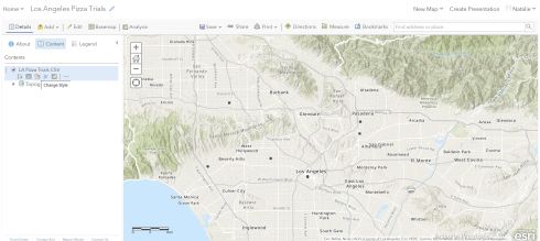
ArcGIS Online
Created by ESRI, ArcGIS Online is the free, internet version of their more complex and expensive desktop program, ArcGIS Pro. The main differences are the complicated spatial analysis tools that we don’t need in the simple mapping our pizza places. You do have to create a free online account, but I’m pretty sure that you have to be signed into google for my maps, so with either software you have to jump through some log in hoops. Once you navigate to the Maps tab and have a new mapping window open, use the “Add” drop down to “Add data from file”
Using the button represented by three shapes under the file we just uploaded, we can change the symbols associated with each of the data points. Make sure you change the attribute we are showing to ‘Pizza Spot” and “Total Score” then we can choose how we want to visualize the data. By choosing two attributes to show, it lets us see each place as its own color, and with a larger area for the higher quality, according to Erin’s rating system.

Finally, we can export the map to something a little more formal using the “Print with legend” option. This is great because it lets us see everything we made clearly, but it does not give the user the ability to click on the symbol and get more information, like it does with the online map. Hosting a map online will always give the user more options to click on data points and zoom in an out. LINK TO MAP
 I think that there are more options on ArcGIS Online but it is definitely less user friendly than Google’s My Maps, which was formatted to be incredibly user friendly, especially if you already are familiar with the google interface. So there you have it, a quick tutorial in free online mapping!

Wow! So cool to see Erin’s blog in map form – that’s actually an incredibly cool concept. It would be incredibly neat if Erin continued to rate the NY pizza places in LA as she visits them in her future time at USC, and publicize them via a map. In my unprofessional (since its not on my blog, its not necessarily correct) opinion, I like the first map style better! The little pizza arrows are so nifty, but more importantly, using higher rating to equal a larger circle in the second map gives the impression of an area where pizza is better, rather than the more specific locations of the first. Those circles could encompass multiple pizza places, thereby implying they have a rating they haven’t earned. Thanks for showing us how to make our own maps, now that we’ve learned so much about them!
LikeLike